Branding & Elements
For the logo, we played around with a few elements from the kitchen and nature. Flowers, ingredients, and a cookie jar but what stuck was a whisk blooming with flowers, which aligned with Pure Joy's values and user personas of home made and healthy. Moving onto type, we wanted something friendly and inviting, while still appealing to an older audience. We kept those same values when choosing our color palette while making sure the packaging would pop on a shelf. Lastly we wanted to present Pure Joy as illustrative, keeping a colorblocked and organic style.

Research & Persona
To begin understanding the brand, we had to first uncover what the product stood for and who it is intended for. To do this, we began with an elevator pitch exercise, personality levers and user persona. Once speaking with the founder to make sure we were on the right track, we moved on to moodboards and type/color exploration.

Branding & Elements
For the logo, we played around with a few elements from the kitchen and nature. Flowers, ingredients, and a cookie jar but what stuck was a whisk blooming with flowers, which aligned with Pure Joy's values and user personas of home made and healthy. Moving onto type, we wanted something friendly and inviting, while still appealing to an older audience. We kept those same values when choosing our color palette while making sure the packaging would pop on a shelf. Lastly we wanted to present Pure Joy as illustrative, keeping a colorblocked and organic style.

Packaging
With our branding complete, the packaging design came easily to us. Our client wanted two cookies per sleeve so it was a matter of getting the cookies measured and brainstorming what would be the best way to present the product. We landed on a sleeve that's similar to that of a granola bar, and features our logo, the flavor in our accent typeface, and illustrations that represent the cookie flavor.


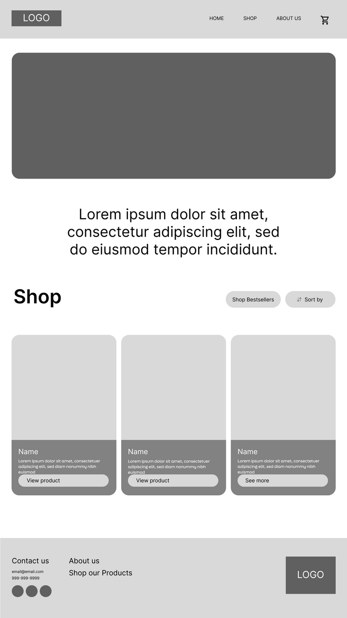
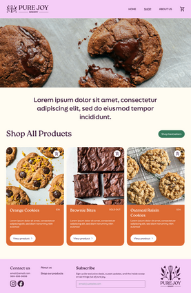
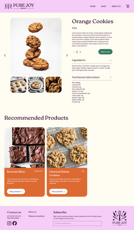
Low & High Fidelity Website
Keeping in mind that our client intended to use Shopify as their commerce platform, we designed their site with a home, shop and about us page. Using Figma, we ensured that each component was ready for our developers to seamlessly transfer over.

Packaging
With our branding complete, the packaging design came easily to us. Our client wanted two cookies per sleeve so it was a matter of getting the cookies measured and brainstorming what would be the best way to present the product. We landed on a sleeve that's similar to that of a granola bar, and features our logo, the flavor in our accent typeface, and illustrations that represent the cookie flavor.

Research & Persona
To begin understanding the brand, we had to first uncover what the product stood for and who it is intended for. To do this, we began with an elevator pitch exercise, personality levers and user persona. Once speaking with the founder to make sure we were on the right track, we moved on to moodboards and type/color exploration.

Low & High
Fidelity Website
Keeping in mind that our client intended to use Shopify as their commerce platform, we designed their site with a home, shop and about us page. Using Figma, we ensured that each component was ready for our developers to seamlessly transfer over.


Pure Joy Bakery
At my time at Scout, Northeastern's student led design club, I had the opportunity to work on a complete brand refresh for Pure Joy Bakery, formally known as Morph Kitchen. This cookie startup was looking for a warm, fun and familiar look to be shelf and e-commerce ready. With this team, we were able to provide a new logo, typographic system, brand book, product packaging, and website.
Scope
Brand identity, web design, UX, UI, packaging
Role
Designer
Team
Ruby Sulter, Business Lead | Alia Ziae-Mohseni, Design Lead | Rei Masuya, Development Lead | Amie Chen, Designer | Daniel Kaplan, Developer | Saanvi Vutukur, Developer
Year
2024


